


Ready for a website?

|

|

|

|

|

|

|

|

|

|

|

|

|

|

|

|

|

|

|

|
1 | 2
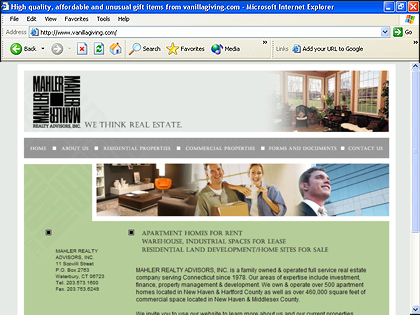
Project: Mahler Realty Advisors, Inc.
Dynamic Website, Back-End Administration, Flash Integration
Company: Mahler Realty is a local real estate firm in Waterbury, CT specializing in rentals
Target: Potential renters.
Challenge: Create a clean, welcoming, professional site to bring Mahler Realty to the web. Allow easy access to property listings for both prospective renters and realtors.
View more about Mahler Realty...
1 | 2
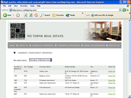
Project: Mahler Realty Advisors, Inc.
The Mahler Realty website projects ease of use and widespread capability. Its open design grants the viewer easy access to property information with minimal clutter, leading them directly from interest in renting to the perfect property and the way to rent it. The small amount of flash used here serves to emphasize the design and brand rather than detract from the user experience.
Behind the scenes, Mahler associates have access to an easy to use website administration area, allowing them to update properties in their database and on their website at will. No special skills or additional programs are needed to manage this system. It is all available through their web browser.
Visit their website: www.mahlerrealtyinc.com
1 | 2
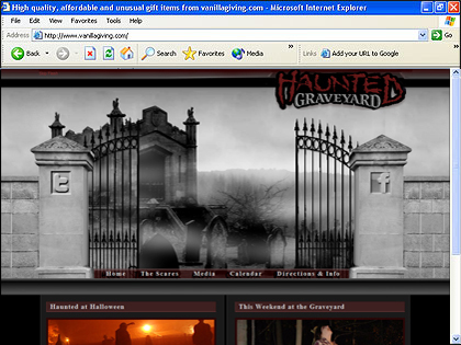
Project: The Haunted Graveyard at Lake Compounce
Dynamic Website, Back-End Administration, Flash Integration, Redesign
Company: The Haunted Graveyard is the Haunted House event hosted by Lake Compounce in Bristol, CT every year at Halloween.
Target: Horror-loving adults, Teen workers, and Brave children
Challenge: Immerse the web visitor into the horror world without making the website look cheesy or revealing too much of the scares in store.
View more about The Haunted Graveyard or view it before its redesign...
1 | 2
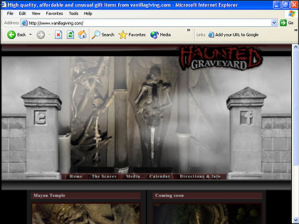
Project: The Haunted Graveyard at Lake Compounce
Users entering the Haunted Graveyard site are immediately pulled in to the graveyard itself through open gates, complete with brief flash animation and sound.
The design emulates actually being in the graveyard while keeping content easy to ready and easily accessible. Without clicking to another page users can find out when the graveyard is open and what special events might be occurring that night on the dynamically updated home page. One more click shows them how to get to the scares.
Behind the scenes, the crew can update events they host as well as an opening status statement on the home page. The administration area is quick and easy to use, necessary for a busy season.
Visit their website: www.hauntedgraveyard.com
1 | 2
Project: The Haunted Graveyard at Lake Compounce
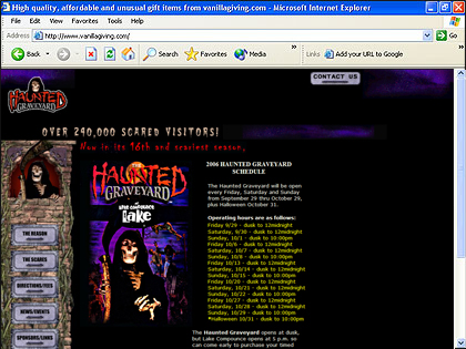
This is the previous design of the Haunted Graveyward website that was updated by NRG.
View the updated version The Haunted Graveyard...

1 | 2
Project: Dupont Business Archives & Systems
Static Website, Flash Integration, Redesign
Company: Dupont Systems and Archives is a professional file storage company, specializing in sensitive data storage and the sale of data storage appliances, located in Southington, CT.
Target: Businesses with large record storage needs
Challenge: Redesign the website for a result that is as clean and orderly as Company's file storing systems.
View more about Dupont Archives or view it before its redesign...
1 | 2
Project: Dupont Business Archives & Systems
Every piece of information on Dupont's site is no more than a click away, neatly ordered by category. The design allows the eye to move from brand information cleanly while maintaining a beautiful aesthetic based on Company colors.
A small amount of flash tastefully integrated into the home page illustrates the purpose of Company as well as what they can do for the visitor clearly. Each piece of information has been optimized to appeal to search engines so the web site is easy to find, easy to use, and easy on the eyes.
Visit their website: www.dupontarchives.com
1 | 2
Project: Dupont Business Archives & Systems
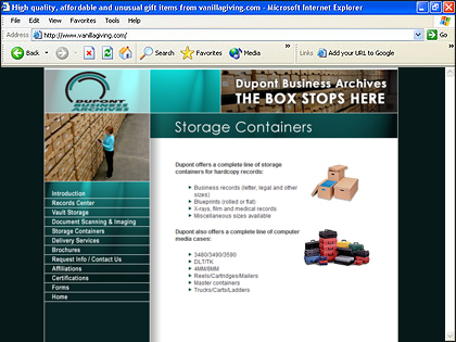
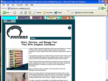
This is the previous design of the Dupont Systems and Archives website that was updated by NRG.
View the updated version Dupont Archives...
1 | 2
Project: Sinkworks - Kithchen, Bath, and Bar Sinks
Static Website, Flash Integration, Redesign
Company: SinkWorks is a Pennsylvania company, specialing in unique custom sinks in everything from Ceramic to Marble.
Target: Upscale consumers and Home remodelers
Challenge: Redesign prior website to create a result that is more appealing, more professional, and allows easier and more informative access to products.
View more about Sinkworks or view it before its redesign...
1 | 2
Project: Sinkworks - Kitchen, Bath, and Bar Sinks
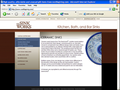
The design of the site itself complements the products provided with earthy tones that change as the category selected changes. Navigation is easy to use and content areas are bright, open, and easy to read.
This site brings a new purpose to our flashlets. Rather than merely illustrating the brand or site purpose, the bit of flash on Sinkworks' site grants the user immediate access to detailed information about their products without even a click being required.
Each category is thoroughly described before its selected, helping the user find exactly what they're looking for and how to get it.
Visit their website: www.sinkworks.com
1 | 2
Project: Sinkworks - Kitchen, Bath, and Bar Sinks
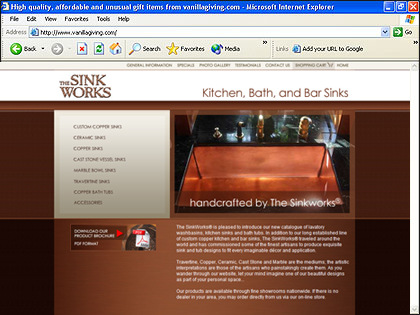
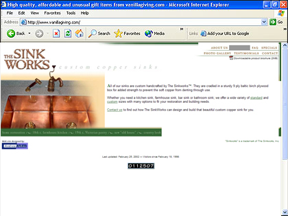
This is the previous design of the Sinkworks website that was updated by NRG.
View the updated version Sinkworks...
1 | 2 | 3
Project: Norpaco Gourmet Foods
Dynamic Website, Back-End Administration, Flash Integration, Redesign
Target: Grocery stores and Food suppliers
Company: Norpaco is New Britain, Connecticut based company specializing in Italian gourmet food sales from Panini Rolls to their own unique Sweetypepp peppers.
Challenge: Redesign existing website for a result that better visually describes the food products offered, helping to deliver the appearance of taste. Also, grant Company access to add and edit products while providing greater check-out functionality for the user and greater data processing ability for Company.
View more about Norpaco or view it before its redesign...
1 | 2 | 3
Project: Norpaco Gourmet Foods
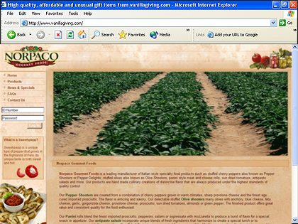
The Norpaco Gourmet Foods site is designed with emphasis on images of their food and the Italian nature of it. An opening flash movie describes the process of their food from the fields of Peru to the glass jar of peppers on the kitchen counter and includes a cameo of the owner.
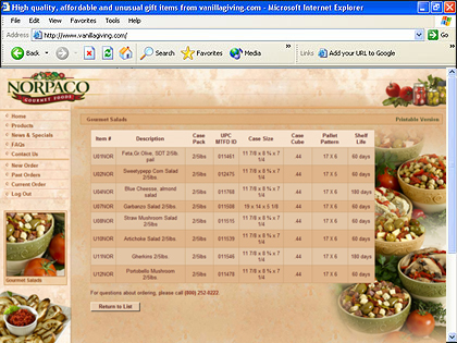
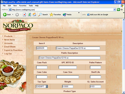
The main beauty of the Norpaco website is the functionality of the programming their dynamic website pages and back-end administration area. Company managers can add and edit all of the content for any product on the site from category to weight to availability and pricing tier.
Users of the site who create an account with them are able to view past orders and re-order them if they choose or modify then re-order.
View more about Norpaco...
1 | 2 | 3
Project: Norpaco Gourmet Foods
Once the order is placed, full information is passed to Norpaco through their admin and also into their desktop inventory management and ordering system.
The website admin can also manage their product inventory, active accounts, and their custom email advertising system. It's ease of use for both the visitor and manager.
Visit their website: www.norpaco.com

1 | 2 | 3
Project: Norpaco Gourmet Foods
This is the previous design of the Norpaco website that was updated by NRG.
View the updated version Norpaco...
1 | 2
Project: The Ross Brittain Report
Dynamic Website, Back-End Administration, Flash Integration, Redesign
Company: The Ross Brittain Report website is a site dedicated to DJs, run by Ross Brittain of radio fame. The site is host to customizable news and entertainment report that is shown behind a login and emailed out for DJs to use in their broadcasts that is generated by many editors in the website back end.
Target: Radio DJs
Challenge: Redesign the previous website to offer a more contemporary look while increasing functionality of report viewing and editing.
View more about RB Report or view it before its redesign...
1 | 2
Project: The Ross Brittain Report
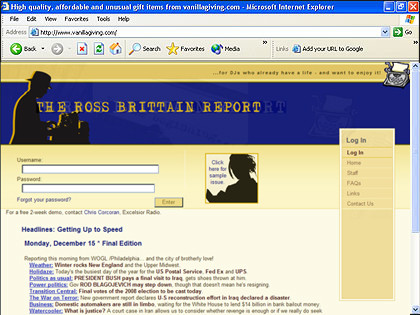
The primary focus of this website is the report newsletter, written by Ross Brittain for the specific needs of the radio DJ. The design is based around this concept with a flash animated typing reporter to emphasize it.
DJs who subscribe to this report can log in, personalize the report to include areas they will read and exclude areas they won't then print it for use in their show. Each report is emailed to the subscriber according to their preferences set in the site.
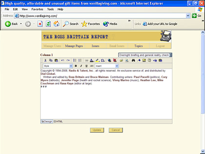
Behind the scenes through the administration area, reporters working for Ross Brittain (and himself also) have access to a full complement of word processing tools with additional pre-set combinations of styles for easy access to edit their section of the report.
This site also allows access to the entire content for the website from home page to contact page for easy management by Ross. The speed of this area allows him to update any content at a moment's notice without the necessity of background tools.
Visit their website: www.rbrepot.com
1 | 2
Project: The Ross Brittain Report
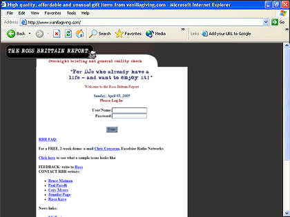
This is the previous design of the Ross Brittain Report website that was updated by NRG.
View the updated version RB Report...
1 | 2
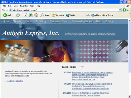
Project: Antigen Express - Immunotherapy
Dynamic Website, Back-End Administration
Company: Antigen Express is a Massachusetts based company, dedicated to the development of vaccines for large, unmet medical needs.
Target: Medical community
Challenge: Create a more modern looking website while maintaining a medical feel. Make all website content easy to read and easy to access. Allow company to update news items.
View more about Antigen Express...

1 | 2
Project: Antigen Express - Immunotherapy
This website bears a unique graphical feel, maintaining the concept of medicine and pathogens without making it feel clinical or gruesome. The colors and images chosen bring about this feel without being too overwhelming and allow lots of clear space for content.
Behind the scenes through their administration area, the folks at Antigen have the ability to update news broadcasts that appear directly on their home page as a short blurb and link to the full news portion of their site. This helps keep their content fresh and interesting, perfect for search engines and site visitors.
Visit their website: www.antigenexpress.com
1 | 2 | 3
Project: Barter Business Unlimited
Dynamic Website, Back-End Administration, Redesign
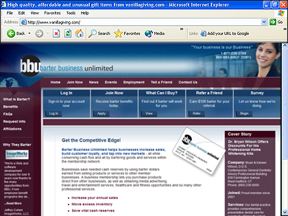
Company: Barter Business Unlimited is a Bristol, CT company, offering barter services to companies across the US. Users of their website can trade goods and services they have a surplus of for goods and services they need with other barter companies.
Target: Small and Medium business owners
Challenge: The primary request for this website was to make many elements such as sign-up, login, referral, tesimonials, and highlighted businesses accessible at a one-click glance without overwhelming the page and crowding their importance out.
Users of this website can quickly learn about barter, become a member, and access their account without having to sift through many pages.
View more about BBU or view it before its redesign...
1 | 2 | 3
Project: Barter Business Unlimited
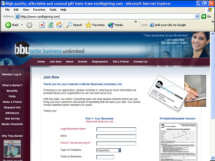
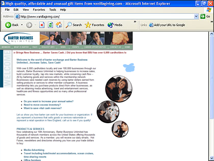
This site represents the web re-emergence of the Barter Business Unlimited company as a sole entity after having been a part of another barter company for a time. The look needed to be completely divergent from both the former parent company and the prior web conception of BBU before merging while providing the same openness and accessibility it previously had.
View more about BBU...
1 | 2 | 3
Project: Barter Business Unlimited
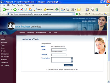
Once inside the account, members have access to barter tips and tools and may quickly locate and trade with other barter members without ever leaving the site.
Behind the scenes, BBU manages everything from the cover stories and testimonials on the home page to member applications and promotional codes.
Visit their website: www.bbu.com
1 | 2 | 3
Project: Barter Business Unlimited
This is the previous design of the Barter Business Unlimited website that was updated by NRG.
View the updated version BBU...
1 | 2 | 3
Project: Club Getaway - Adventure Weekends
Dynamic Website, Back-End Administration, Flash Slideshow
Company: Club Getaway is a whole-package weekend retreat in Kent, CT with offices in New York, NY. They offer outings for groups and indivduals including everything from sport adventures to cruises to wedding getaways.
Target: Active adults, Thrill-seekers, Engaged couples, Family vacationers, Singles, and groups such as Schools, Businesses, and Scouts...
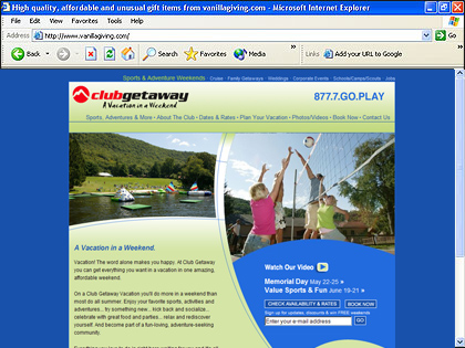
Challenge: This website needed to immediately convey the concepts of "fun" and "action" without visually overloading the site viewer. This effect is achieved with flowing curves and bright colors that playfully frame images, slideshows, and videos that the administrators at Club Getaway can change at any time.
View more about Club Getaway...
1 | 2 | 3
Project: Club Getaway - Adventure Weekends
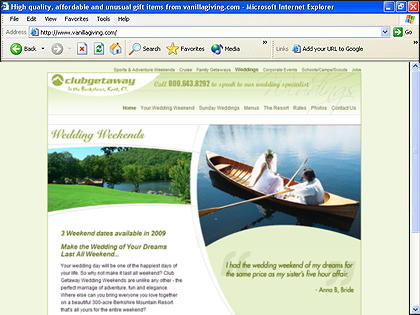
The Club Getaway slideshow is unique in that it will mask any image placed within it with the design of the site, no matter how the image originally appeared. Additionally, inside the website, the wedding section carries this look with more elegant tones to convey a different message.
View more about Club Getaway...
1 | 2 | 3
Project: Club Getaway - Adventure Weekends
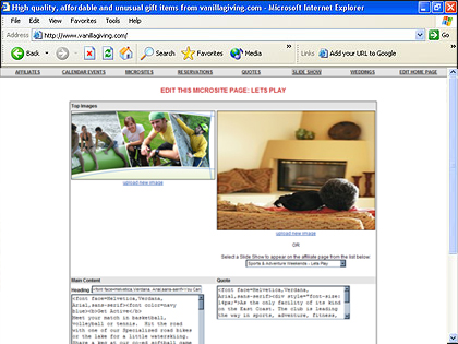
Club Getaway staff manages content from the main pages to affiliate microsites that are created dynamically on the fly for each group that needs them.
They also handle reservations and requests from within the site. Its programming allows the admin user the freedom to change their site at will with no editing tools or skills necessary.
Visit their website: www.clubgetaway.com
1 | 2
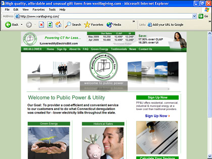
Project: Public Power and Utility
Dynamic Website, Back-End Admin, Referral Tracking, Google Protocol
Company: Public Power is an alternative electric energy provider in the state of Connecticut. They offer generally lower rates than CL&P and UI as they have less overhead.
Target: CT electric bill payers
Challenge: The owners of this website came to us looking to update the code of the site to help make it friendlier for search engines without changing the overall appearance. They were also seeking website programming to increase the functionality of the site.
View more about PP&U...
1 | 2
Project: Public Power and Utility
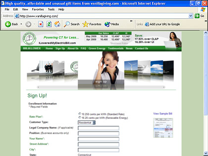
In the end the site transitioned from bulky code, consisting primarily of images, to a light-weight easy-to-edit version that allows for dynamic areas, controlled behind the scenes. From his admin, the site manager may review applications and customers, send out email blasts, and update the current prices to see them reflected throughout the site from the banner to the savings calculator.
In addition to that, the site revision has made the site smarter. It now includes a referral tracking system that gives commission credit to staff members based on the method the user entered the website. The sign-up form offers "smart" solutions, giving the user only the fields necessary for them based on their provider and checking for validity of each field type whether it's a phone number or account number.
Visit their website: www.ppandu.com
1 | 2
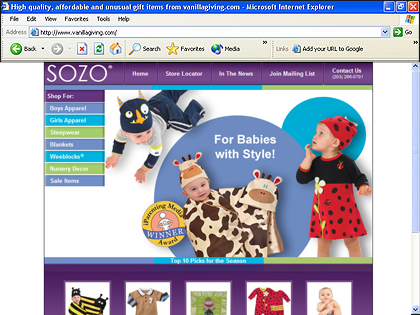
Project: Sozo USA - Clothes for Babies with Style
Dynamic Website, Back-End Administration, Dynamic Navigation, Redesign
Company: Sozo USA is a Unionville, CT based company, specializing in unqiue clothing for babies and toddlers - everything from Blankets and Rompers to Nap Sacks and Weeblocks.
Target: Mothers, Friends and relatives of mothers
Challenge: The initial Sozo site had a lot of picture-map style images that made navigation difficult at best and a Where's Waldo search at worst. It also had category issues with items not quite fitting into the defined slots and buried 5 or 6 levels down in not entirely intuitive places.
The challenge then, was to revamp the category system in a way that made sense without letting any products fall through the cracks. In the end, we built the framework for a category system, but programmed in the ability for the Sozo staff to add their own categories in their behind the scenes management area as their product line grew.
View more about Sozo USA...
1 | 2
Project: Sozo USA - Clothes for Babies with Style
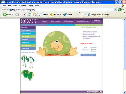
From their website management area, the Sozo staff can track and edit everything from rompers to retailers. They can also get a glimpse of public opinion of their site and products from right within their website. Each area is coded to allow the most capability for the least effort.
Outside of the admin, website users can get up close to the details of each product in a cheerful, quiet baby environment. They can find, not only what they're looking for, but also suggested similar products just a few clicks away. In fact, the user survey of the site noted that over 92% of the site's visitors "walked" away happy.
Visit their website: www.sozousa.com
1 | 2
Project: The Hospital of Central Connecticut
Dynamic Website, Back-End Admin, Employment and Donation Management
Company: HCC is a multi-campus hospital located in Southington and New Brtain, CT, created out of the merger of Bradley Memorial Hospital and New Britain General Hospital.
Target: All CT residents with healthcare needs
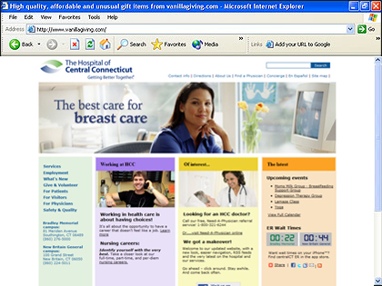
Challenge: When Bradley Memorial Hospital merged with New Britain General Hospital, the newly created Hospital of Central CT came looking for a company to build their clean, open, accessible design with a lot of power and functionality behind it.
The site itself contains hundreds of informative pages, easily accessible through either a dynamic menu or a constant search box. Main way-points of the site are also static so a user can retrace their steps should they get lost.
View more about HCC...
1 | 2
Project: The Hospital of Central Connecticut
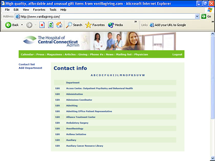
Behind the scenes, the hospital can manage an event calendar, promotional items such as free bibs or ICE stickers, online donations, newsletter subscriptions, greeting card requests, job applications and postings, upcoming news, press and magazine articles, physician information, and more, including every phone number listed throughout the site.
Each department can do all this with the click of a few buttons and management pages no more complicated than an email form.
In addition to the main site, we also host and service HCC's Spanish site, hospitaldecc.org, its online employee orientation program, and its senior Alliance Advantage program (complete with its own dynamic event, newsletter, and vendor lists...).
All of these sites are somewhat of an eternal work in progress, with their content being regularly updated and pages being added frequently.
Visit their website: www.thocc.org
1 | 2
Project: Black-eyed Sally's - BBQ & Blues Restaurant
Dynamic Website, Back-End Administration, Dynamic Events List, Redesign
Company: Black-eyed Sally's is a Hartford, CT restaurant featuring BBQ, Cajun, and Southern food with Blues and Jazz music to match. They are well-known for their Mardi Gras parties.
Target: Music lovers, Southern food enthusiasts, Families, Partiers
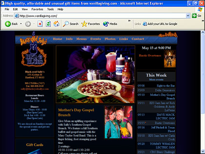
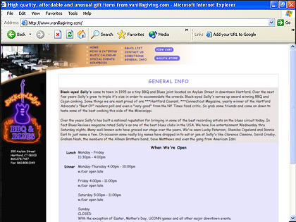
Challenge: Black-eyed Sally's restaurant boasts the twin goals of great music and great food. That needed to be conveyed on the new version of their website as in the past the site was mostly food-oriented. They also wanted to display the maximum amount of commonly requested information at a glance and a look to match the interior redesign of the restaurant itself.
View more about Black-eyed Sally's or view it before its redesign...
1 | 2
Project: Black-eyed Sally's - BBQ & Blues Restaurant
We accomplished this with dark blacks and navies, punctuated by nearly neon oranges and blues. The two focuses of the home page are large, delicious images of food served and a constantly updating music events list, complete with artist photos.
Everything from hours of operation to menu items are easy to spot and only a click away - or less.
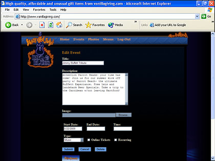
Behind the public face of the website, the site owner can update his music list with photo and ticketing options as well as update each menu item. With a combination of a dynamic events list, slideshow, and editable main text and image, the home page is nearly entirely managed behind the scenes.
It's easily and quickly changeable to match the thriving beat of Black-eyed Sally's.
Visit their website: www.blackeyedsallys.com
1 | 2
Project: Black-eyed Sally's - BBQ & Blues Restaurant
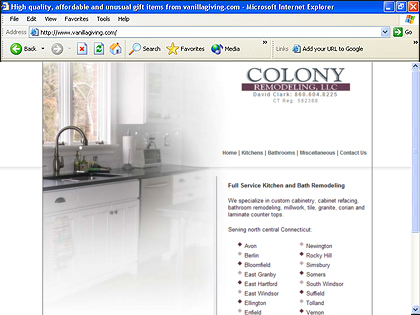
This is the previous design of the Black-eyed Sally's website that was updated by NRG.
View the updated version Norpaco...
1 | 2
Project: Colony Remodeling - Kitchen & Bathroom
Dynamic Website, Back-End Administration, Dynamic Gallery
Company: Colony Remodeling is an Enfield, CT based full service kitchen and bath remodeling service, specializing in cabinet refacing and storage area overhauls.
Target: Homeowners
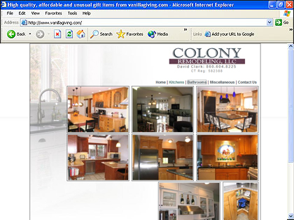
Challenge: For Colony Remodeling, the site had to be clean, yet showcase large and complex images of remodeling work. We turned the entire site into a large portfolio with even the background displaying work well done. Each dynamic interior gallery page is managed behind the public website so the work is constantly fresh.
View more about Colony Remodeling...
1 | 2
Project: Colony Remodeling - Kitchen & Bathroom
Site users can go three steps into each project. They can look at an overview of each project then at all the images of a single project, detailing its process, then finally at the enlarged view of any image they select. No detail is left behind. The site is beautifully simple and simply gets the job done.
Visit their website: www.colonyremodeling.com
1 | 2
Project: CT Bankers Association
Dynamic Website, Back-End Administration, Event Windows, Redesign
Company: The CCBA is a community group, connecting banks and bankers across Connecticut for social and information events and gatherings.
Target: CT Bankers
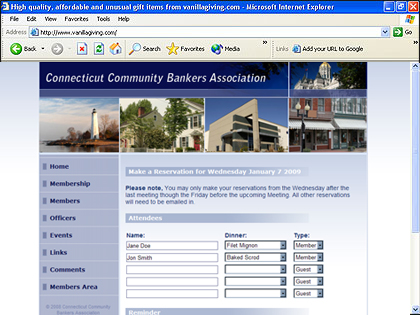
Challenge: The Connecticut Community Bankers Association is in a unique situation. The bank in charge of the group changes regularly.
They host regular events for their members and guests so as they torch and member information passes from one set of bank staff to the next, the information transfer must be seemless and the reservation process must remain the same even though a new group is handling it.
View more about CCBA...
1 | 2
Project: CT Bankers Association
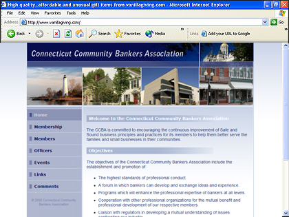
We created a reservation system for them that handles members, guests, and their meals. They can also manage the events entirely, print guest lists and name cards directly from the site, and accept reservations for the next event.
The site also allows for a list of the current group officers to be changed by the current group. Even the contact information for the site is updated dynamically from a behind the scenes administration area.
All of the changes flow smoothly and a user visiting the site can read the most up to date information and reserve places at the next event when the reservation window for that even opens with just a few clicks every time. Members can also log in and manage their profiles to help the leading group maintain accurate information without much hassle.
The site as a whole was designed around the group's specifications to best represent CT. It is clear, clean, and concise, and easier to use because it is so.
Visit their website: www.ctcba.com

1 | 2
Project: Conversano Associates. Inc.
Static Website
Company: Conversano is a New York based group of building and zoning consultants, representing clients from the Fire Department to the Department of Transportation.
Target: Municipal workers seeking professional building and zoning assistance
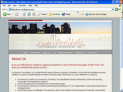
Challenge: The Conversano website needed to demonstrate who they are and what they do quickly though building codes and zoning are not the most graphically fruitful concepts.
View more about Conversano Associates...
1 | 2
Project: Conversano Associates, Inc.
Here the site visitor is greated with a New York skyline and direct links to common services such as permits and certificates of occupancy as well as broader links in a distinct navigation area to the main site sections such as services and online resources.
Primarily here, the content of the site speaks for itself so we put little in the way of it graphically and left it easily accessible and nicely formatted to be easy on the eyes.
Visit their website: www.conversanoassoc.com
1 | 2
Project: CV Tool Company
Static Website
Company: CV Tool is a CT and MA based machine company, specializing in CNC milling and turning as well as precision grinding and jig bore work.
Target: Manufacturers
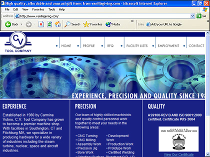
Challenge: The challenge in this one was displaying the concept of a machine shop prettily or more precisely, to give the idea of machines without actually showing machines at work as a machines that tend to be dirty do not lend well to a clean, fresh look.
View more about CV Tool...
1 | 2
Project: CV Tool Company
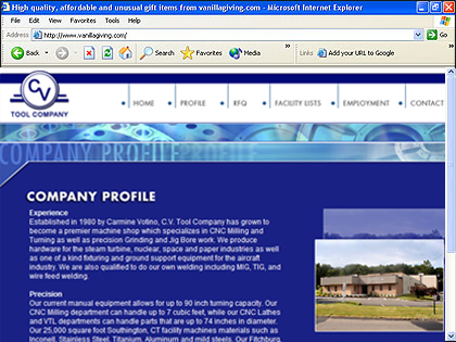
With the help of various circular machine parts, we stylized the banner images into a sleek machine of its own, representing the cleanly efficiency that CV Tool wanted to project.
Despite being brightly colored, none of the text is difficult to read and all content is quickly accessed through a clean navigation system, drawn very much like a stylized measure - machine concepts without the machines.
Visit their website: www.cvtool.com
1 | 2
Project: Wellspeak, Dugas, & Kane - Real Estate
Static Website
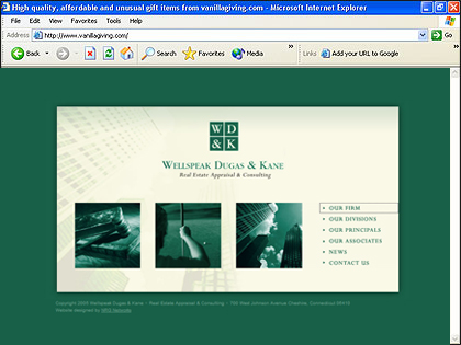
Company: Wellspeak, Dugas, and Kane is a Cheshire, CT based firm, specializing in real estate appraisal and consulting.
Target: Businesses with upcoming real estate projects
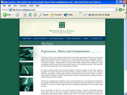
Challenge: Wellspeak, Dugas, and Kane is a firm several specialties: real estate consulting, golf advisory services, and real estate valuation. Each principle has a different focus and while they are related, they are distinct entities. Using an icon continuation, we attempted to craft the site with both the overall feel for real estate and the image of each specific section.
View more about Wellspeak, Dugas, & Kane...
1 | 2
Project: Wellspeak, Dugas, & Kane - Real Estate
While boldly colored, the site is easy on the eyes overall. It is a mix of contrast high enough to increase visibility yet low enough to avoid blinding web visitors.
Other elements of the site hint at blending in to each other to create a uniform feel that everything there, from the illuminated titles and stylized page headings to the fading header and tiny footer, belongs together. This site has it all together, like the firm.
Visit their website: www.wdk95.com
1 | 2
Project: Whippersnappers Play Gym
Static Website
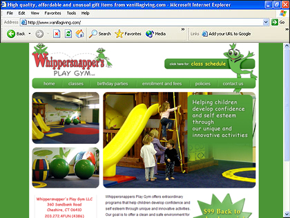
Company: Whippersnappers is a Cheshire, CT activity gym for kids and young adults featuring programs from Drop & Hop to Cheerleading and Acrobatics.
Target: Parents of small children and pre-teens
Challenge: The goal of this web site was to create a design that is fun and playful while also being clean and clearly legible.
View more about Whippersnappers...
1 | 2
Project: Whippersnappers Play Gym
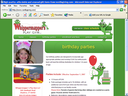
We worked with the logo motif of the hopping frog to create the look. It is emphasized by the rounded lilypad corners of nearly every graphical element from photos to navigation and the jumping trails within the title elements.
The frog green is contrasted with clean white to clear up the reading area while remaining bright and perky. Overall, the site is energetic without being overwhelming.
Visit their website: www.whippersnappersplaygym.net/
1 | 2 | 3
Project: Chase Parkway Volvo-Subaru
Static Website, Redesign
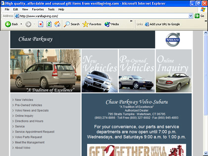
Company: Chase Parkway is a Watertown, CT car dealership, specializing and new and used Volvos and Subarus.
Target: Car owners and New buyers
Challenge: Often new clients will remark on the style of this website. It is bold and somewhat in-your-face without being cluttered or intimidating. Immediately after a web user enters the site, their eyes are drawn toward the three main options: New Vehicles, Pre-Owned Vehicles, and Online Inquiries.
90% of the visitors to this site click into one of these clearly illustrated main goals to be transported directly to what they were looking for without expending any more effort than a mouse click.
View more about Chase Parkway or view it before its redesign...
1 | 2 | 3
Project: Chase Parkway Volvo-Subaru
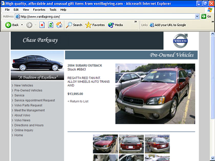
Far away from the pressures of a salesroom, users of this site can peruse a gallery of cars and view each piece of interest from all angles.
While this is standard for many used car websites, this version incorporates a quick-loading function that requires no page refresh or re-loading of images, leading to an entirely less frustrating experience for the used car website user.
View more about Chase Parkway...
1 | 2 | 3
Project: Chase Parkway Volvo-Subaru
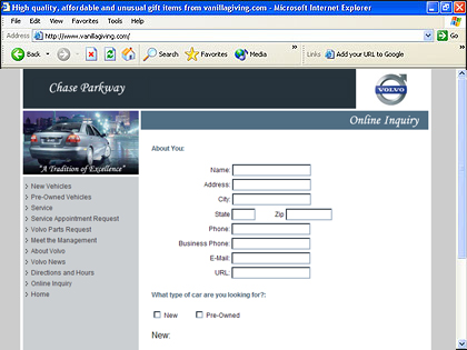
This website incorporates a contemporary look with a quick loading, easy to navigate function. Highlighting navigation buttons adds visual appeal without taking away form the autos as centerpieces. Visitors can view cars and policies in detail as well as submit queries from the comfort of their own home.
Visit their website: www.chaseparkway.com

1 | 2 | 3
Project: Chase Parkway Volvo-Subaru
This is the previous design of the Chase Parkway website that was updated by NRG.
View the updated version Chase Parkway...
1 | 2
Project: A & D Home Health Solutions
Static Website, Google Protocol
Company: A&D Home Health Solutions is a Connecticut based company with offices in Newington, Hamden, New London, and Danbury, who offers healthcare related services for elderly citizens such as in-home care, medication and nutrition management, and nursing home research services.
Target: Children of elderly parents, Relatives, Elderly adults
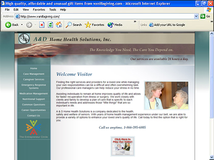
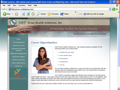
Challenge: A&D Home Health Solutions needed to appeal to users investigating nursing homes whether for themselves or others. The design is intentionally open and uncomplicated.
View more about A & D Home Health Solutions...
1 | 2
Project: A & D Home Health Solutions
Navigation buttons are large with a wide clickable area and conveniently located in the same place at all times to the left of the text. All main navigation falls here and it does not obscure any of the reading area. The reading area itself is high contrast with little in the way of the larger text.
Paragraphs are laid out simply and address points directly. The site as a whole is very easy to use and view yet is not plain. All design elements are geared for the impression of comfort and aid in addition to maintaining ease of use and clarity.
Another feature of this website is the Google Protocol, meaning additional steps were taken to help increase the site's visibility on Google and other search engines. A positive side effect to these measures is increased accessibility for impaired site users, helping make this site perfect for its target audience.
Visit their website: www.adhomehealtsolutions.com