


Ready for a website?
Customer Support » Screen Resolution
Just as there are many monitor sizes out there, there are many screen resolutions. If you're here, you probably want the down and dirty concept rather than the technical one so onward we go.
Consider your monitor filled with little objects called pixels. Each resolution setting on your monitor will either shrink or expand the size of the pixels until your screen can fit the number of pixels noted in the resolution setting. For example, if you had a 14" monitor set at an 1024 x 768 resolution, your pixels would be whatever size that would allow them to go 1,024 pixels across and 768 pixels down. If you changed your resolution to 800 x 600, you would notice that the objects on your screen have grown and become less detailed. This is because you now have fewer pixels and the ones you do have are larger.
The width and height of a web site can be set to either a certain number of pixels or a percentage of the screen size (screen size here refers to the size of a browser window within the monitor screen). If a site is set to a number of pixels that is much smaller than the number of pixels in the monitor resolution then the site appears very small relative to the total monitor space. If the site is set to a number that is larger than the resolution then the site can not be viewable all at once and scrollbars appear to allow you to scroll to the rest of the content that has been chopped off. Because there are many choices of screen resolutions out there, it is impossible to pick a size for the site width and height that will fit them all exactly.
Some sites do just this just as some clients prefer it. A site set to a percentage of the screen size will grow or shrink as the resolution requires. The problem here is that the flow of text is not controllable to the end of the line. If a page of the website were to be stretched wide (large number of pixels) the text would flow in one long line, making it hard for the viewer of your page to read it. We could control the text into columns like a newspaper, but then you would have an expanding and shrinking about of empty space beside it. There isn't really a catch all method so it comes down to preference.
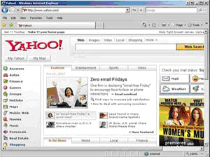
Yahoo.com in 800x600
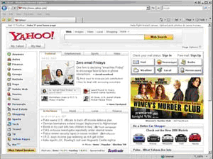
Yahoo.com in 1024x768
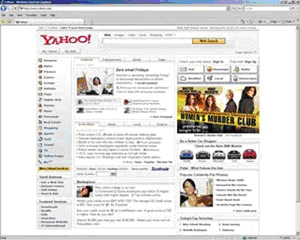
Yahoo.com in 1280x1024